Monday, April 16, 2012

Good and BadType, LA12.


Kerning of main wording on logo/sign leaves for a bad typeface, Letters are spaced too far apart. 


Writing over the background hard to read when small, colours of the text and background are the same, with no difference in hue another example of a bad typeface.


An example of Good Typeface. the Title of the Book and the Authors name are both easy to read as is the other text on the page (scanner took away the brightness of the " THE INFERNAL DEVICES" gold leaf)


Another example of Good Typeface. The main text of the card is done in white'silver, thus making it stand out. The secondary text is done in bright yellow, drawing ones focus in. The whole card is easy to read.


Another example of good typeface, the sign itself is big enough to be noticed and the writing is bold yet simple enough, the contrast of the blue on white also helps.


The Target Logo/Sign. Is a good example of a nice, simple and yet effective typeface. the bright colour and font used don't push people away from wanting to walk into the store as some signs do. the use of the bright red colour, help it to stand out on the white of the building.


The K-mart Logo/Sign. Is a good example of a nice, simple and yet effective typeface. the bright colour and font used don't push people away from wanting to walk into the store as some signs do. the use of the bright blue and red colours, help it to stand out on the white of the building.


Friday, March 23, 2012

Poster Design, LA13.


For this quote, I wanted something simple, yet elegant so chose a font that had some, but not much decoration on it. I then used simple layer effects to highlight what i thought were the key words in the quote.
I limited myself to a few colours so as not make the poster seem "messy" or "cluttered" Keeping the text grey and embellishing it with black, blue and white.

50 Pumpkins, LA7.


Thursday, March 22, 2012

Type Label, LA10.


Times Roman/ Times New Roman, Is a traditional, Serif typeface. Most commonly used in print publishing such as newspapers and books.

Sketching Layouts, LA9.

Website
Newsletter

Business Card

Wednesday, March 21, 2012

Friday, March 16, 2012

White Space, LA6.

In page layout, illustration and sculpture, white space is often referred to as negative space. It is that portion of a page left unmarked: the space between graphics, margins, gutters, space between columns, space between lines of type or figures and objects drawn or depicted. The term arises from graphic design practice, where printing processes generally use white paper.


  Billboard.


The white space in this example is the black background of the billboard. It helps the text and image to stand out to people walking/driving past.


Website.


The Google homepage is a great example of white space. The logo and the search box located top, centre are surrounded by a white background with little detail to draw ones attention away from the main part of the page.


Print Advertising.


This advertisement for POM, pomegranate juice, utilises white space to help the message and art work stand out. by limiting the colours and keeping the background white it keeps people focused on the message that is being conveyed.


My Choice: Landscaping.


The landscaper in this example has made use of white space by filling most of the area with white pebbles/gravel. Although people looking at the garden may first look at this they are drawn back to the feature rocks each time. 


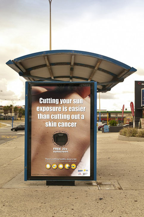
  Street Advertising.


Although harder to discern in this example. the white space is again the background upon which the main message is located.