Friday, March 23, 2012

Poster Design, LA13.


For this quote, I wanted something simple, yet elegant so chose a font that had some, but not much decoration on it. I then used simple layer effects to highlight what i thought were the key words in the quote.
I limited myself to a few colours so as not make the poster seem "messy" or "cluttered" Keeping the text grey and embellishing it with black, blue and white.

50 Pumpkins, LA7.


Thursday, March 22, 2012

Type Label, LA10.


Times Roman/ Times New Roman, Is a traditional, Serif typeface. Most commonly used in print publishing such as newspapers and books.

Sketching Layouts, LA9.

Website
Newsletter

Business Card

Wednesday, March 21, 2012

Friday, March 16, 2012

White Space, LA6.

In page layout, illustration and sculpture, white space is often referred to as negative space. It is that portion of a page left unmarked: the space between graphics, margins, gutters, space between columns, space between lines of type or figures and objects drawn or depicted. The term arises from graphic design practice, where printing processes generally use white paper.


  Billboard.


The white space in this example is the black background of the billboard. It helps the text and image to stand out to people walking/driving past.


Website.


The Google homepage is a great example of white space. The logo and the search box located top, centre are surrounded by a white background with little detail to draw ones attention away from the main part of the page.


Print Advertising.


This advertisement for POM, pomegranate juice, utilises white space to help the message and art work stand out. by limiting the colours and keeping the background white it keeps people focused on the message that is being conveyed.


My Choice: Landscaping.


The landscaper in this example has made use of white space by filling most of the area with white pebbles/gravel. Although people looking at the garden may first look at this they are drawn back to the feature rocks each time. 


  Street Advertising.


Although harder to discern in this example. the white space is again the background upon which the main message is located. 

Thursday, March 15, 2012

Negative Space, LA5.


Negative space (a.k.a. whitespace in page layout), is the unoccupied areas that surround the subject matter.

Negative space is most evident when the space around a subject matter, and not the form itself, forms an interesting or artistically relevant shape.


Example 1. Naturally Occurring Negative Space

Taken from the web via a Google image search.

In this example of negative space in nature is the background, despite it's pattern and colour is the negative space. In looking at the picture one is drawn instinctively to the silhouette of the tree.


   Example 2. Negative Space Logo

Taken from the web via a Google Image Search

In this example, the designer has used a stencil effect. The black areas in this example are the artwork of the logo, while the white, being the negative space and thus making the shape of the giant panda.


 Example 3. Negative Space in Film

A still photo from the movie The Dead Girl, starring Rose Byrne.

In this shot, the camera man has used the use of a shadow blocking out half the scene to create negative space, forcing one to focus on the character of which Rose Byrne is portraying.


Example 4. Negative Space in Comics

An old, original Charlie Brown comic. Image found on the Internet.

In this example, the negative space is the background or environment in each panel. Being simple and of only few lines, people focus more on the foreground subjects of each panel.


Example 5 Negative Space in Vehicle Signage 

In this photo of a Repco, company car. the negative space it the car's body. The bright yellow and white helping the "Repco" Logo on the doors stand out and draw in people's attention.


Example 6.  Negative Space in Street Signage

In the example of this street sign, it again uses a stencil design and bright background. Helping the main art/subject of the sign to stand and to be noticed. The negative space being the yellow background of the sign.


Black Boxes. LA4.


Friday, March 9, 2012

Layout Hierarchy. LA3.


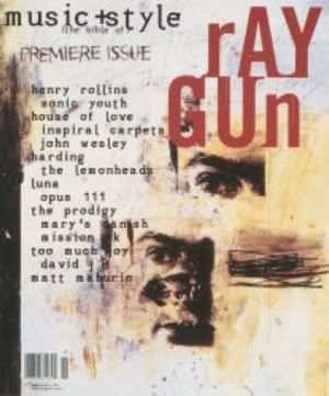
Repetition of Shape: 
            Rectangles are used to separate different areas of the design. This helps to discern different areas and to keep things in proximity to each others.

Colour Unity: 
           The main areas on the cover of the magazine use only a few main colours, other than black and white. Thus making it easier to focus and be interested in the aspects of the design.

Typographic Unity:
         Other than the Magazine Title, the rest of the cover uses the same font. This helps keep the look of the design simple. Using Bold and Italicised effects helps to add to the simple effects of the design. Also used in this example are lower case and upper case lettering, helping ot add emphasis on certain words while still using a simple, easy to read font type.

Tuesday, March 6, 2012

Layout Hierarchy. LA2 Part 2.


  1. Main Story Title
  2. Main Story Photo
  3. Magazine Name
  4. Inside Small Feature Story
  5. Inside Small Feature Story
  6. Inside Small Feature Story
  7. Inside Special
  8. Price
  9. Story Strip

Monday, March 5, 2012

Layout Hierarchy. LA2.


  1. Main Headline
  2. Sub-Heading
  3. Location Map
  4. Inside Story
  5. Inside Story
  6. Inside Story
  7. Main Story Pic
  8. News Paper Name
  9. Advert