 |
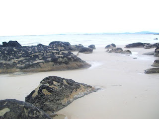
| Picture 1: Before |
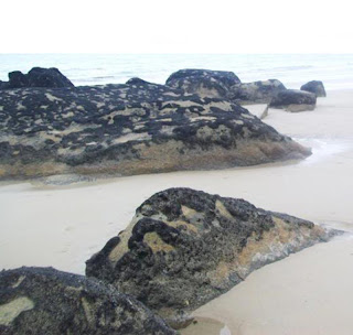 |
| Picture 1: After |
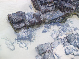 |
| Picture 2: Before |
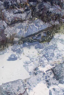 |
| Picture 2: After |
 |
| Picture 3: Before |
 |
| Picture 3: After |
 |
| Picture 4: Before |
 |
| Picture 4: After |
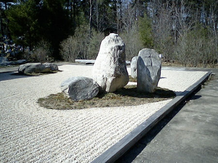
Picture 1: Cropped out the smaller rocks to the right, to draw emphasis to the more interesting, larger rocks on the left.
Picture 2: Cropped out the rocks and sand on the left, to draw attention to the main part of the rock pool on the right.
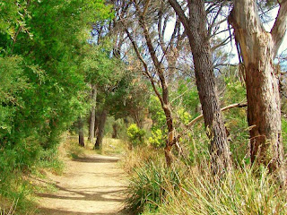
Picture 3: Cropped out most of the trees in the foreground to draw attention to the "tunnel" effect over the path and to the trees in the background.
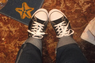
Picture 4: Cropped out the paper to the right and most of the rug to the left, and made the image focus on the shoes which is what the photo was focusing on.


